whatbrentsay
6/16
I had this in my WWDC '21 wishlist:
Why didn't widget improvements and the App Drawer come to iPad when they came to iPhone? Certainly a year is enough to resolve whatever the problem was.
Be careful what you wish for because you just might get it. The App Drawer on iPadOS is great and I quite like its inclusion in the dock. I wish I could express the same level of excitement for widgets.
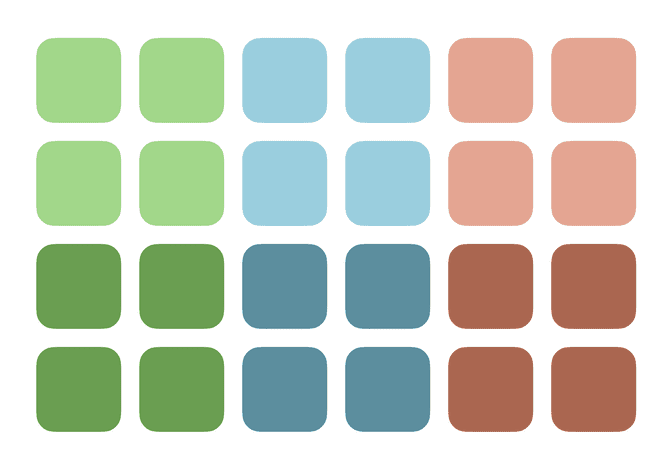
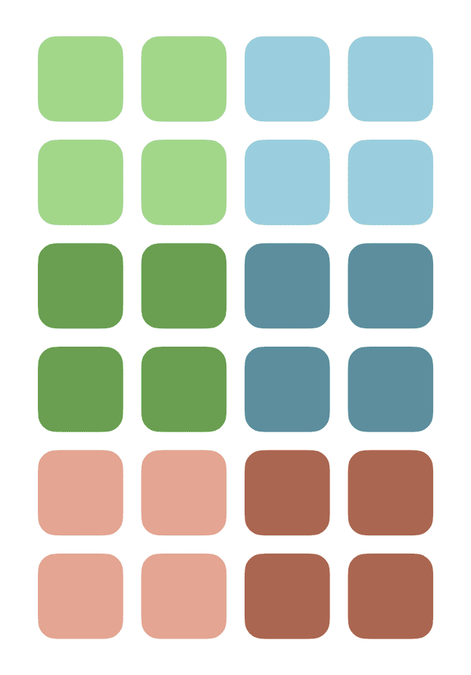
There are two major quirks with iPadOS's widget implementation; they're the source of my uneasiness. The first is a side effect of the different portrait and landscape grid configurations—4x6 and 6x4, respectively—and the second is the rigid set of the rules widgets have to obey.
When you place widgets on the Home Screen, you're actually working with a collection of 6 2x2 sub grids.
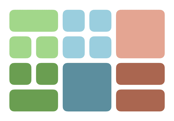
Widgets are restricted to a finite set of layouts within their sub grid. Additionally, each sub grid is paired with another one. The sub grid pairings are important when items are moved between sub grids and when the device rotates.
Using landscape as the baseline, the third column of sub grids are rotated 90˚ left to fill in the bottom two rows in portrait orientation.
This keeps most of the items on the Home Screen in a very similar place. The top right landscape sub grid has to cover the most ground.
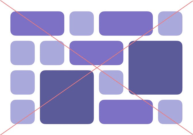
The sub grids mean that only uniform layouts are possible.
Any grid that is uneven, like the example below, simply can't be created.
Widgets will either move their entire sub grid or bring along the other item in their sub grid row to ensure the uniform layout is preserved.
The way iPadOS shuffles sub grids is not ideal but is a reasonable solution to the problem of having different layout grids across orientations. Especially when you consider all the other rules the Home Screen imposes (like flowing all items left to right).
I'm less sold on sub grids as a concept. Moving widgets around the iPadOS Home Screen can become an exercise in frustration as other items shuffle around in unexpected ways. This problem is present on iPhone, too, but it's more egregious with iPad's landscape orientation.
The bigger problem is I don't see a way Apple can break up sub grids without a huge change to the way iPadOS's Home Screen works overall. If any feature has exposed how antiquated the iOS Home Screen is, it's widgets. Oddly enough, this gives me confidence that a more thorough change to the Home Screen is coming in the future. These quirks, and their associated user experience oddities, just aren't worth keeping around.


