whatbrentsay
2/10
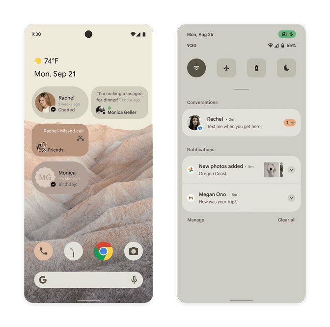
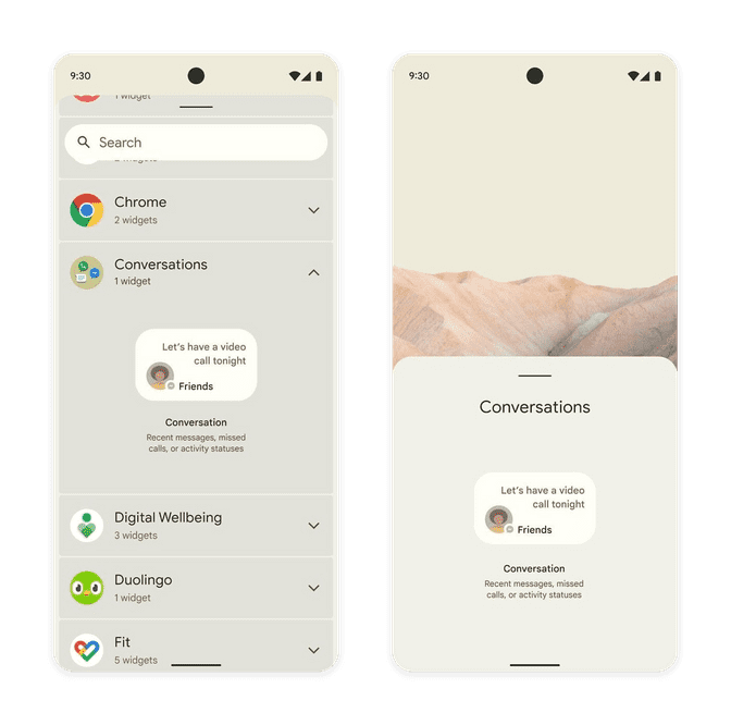
XDA Developers shared a handful of potential Android 12 screenshots this week. Their origin is said to be from an early draft document that Google made to summarize the changes in the new version of Android. As a designer, I just can't resist dropping my two cents into the internet commentary collection bucket.
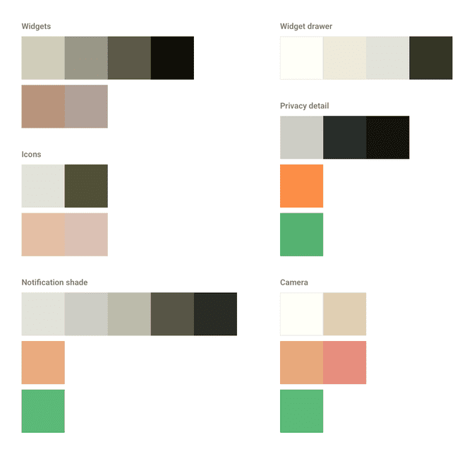
The most striking thing about these screenshots is just how harmonious the colors are. The color usage is so sophisticated, it looks more like a designer's mock up than something possible dynamically. I sampled the predominant colors across the above screens and here's what those swatches look like. Note how consistent the neutral tan colors are across each area. The pink accent fits in perfectly, too.
This is some nice stuff. What I can't explain is how the home screen wallpaper image contributes to the color scheme. Just comparing it to the colors used across the UI, I would assume they're pulled out of the image. That's an easy, common thing for UI Designers to do. Could that be something Android 12 could do? Pick matching UI colors based on a given image? With these kind of results? That would be very impressive. My best guess is that this is a wallpaper that comes with Android 12 and this particular tan/pink combo is also a built in color/accent option.
That light pink-ish accent color is subtly everywhere, too. It's in all of three of the docked system app icons. Not only that, but it is slightly different depending on where it's used. Look at the accent in the phone app icon background vs the camera app icon lens vs the number indicator background on the FB Messenger notification. Some of these differences may be because of image quality but not all of them can be explained that way. Again, this is some Good Design. If Android is doing this dynamically based on a single color choice made by the user (or dynamically from the wallpaper choice), I am very impressed.
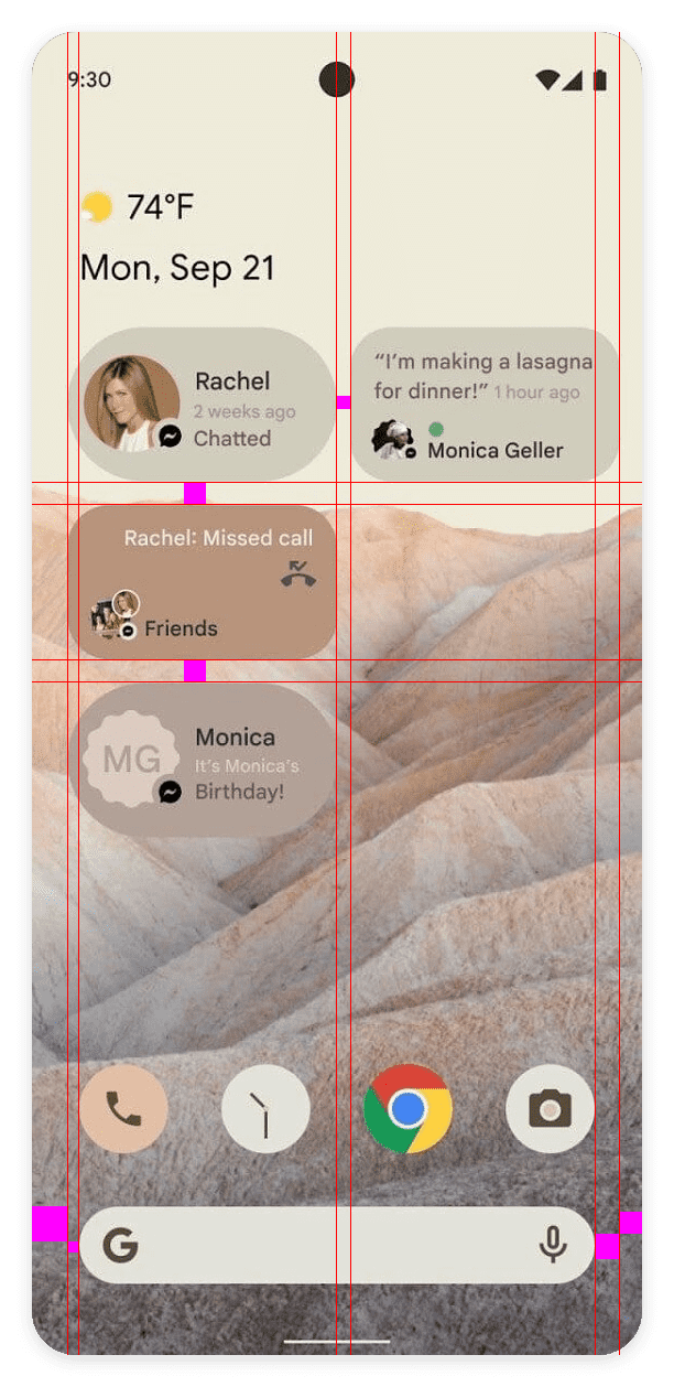
What I'm less excited about is the overall layout on the home screen.
Seriously, what's going on here? The left and right widget margins aren't the same when compared to the app icon grid and the left/right screen margins. This, unfortunately, is objectively Bad Design. If anything makes me believe these images are mockups rather than screenshots, it's this.
I'm also not thrilled with what I'm seeing from the widgets. There's only two widget types present so I'm mostly speculating but it looks like Android is trying to add consistency to widget shapes without committing to a single shape. My assumption here is that shape is communicating a key difference in how these widgets work. That's fine—shape is one of the basic tools designers use to unify or differentiate. Is that important enough to sacrifice consistency, though?
These two widgets look odd next to one another. The fully rounded widget on the left looks odd, in general, with its uneven top/bottom margins and left aligned circular contact image. This type of design problem crops up whenever you have a rounded element nested in another rounded element. If this type of widget is meant to be used for all widgets of its type, it's a questionable design decision to move forward with. Will there be other widget shapes? Will all widgets be forced to adopt these new shapes? I have a lot of questions.
The last nit I'd like to pick is this quirky choice in the notification shade.
The active WiFi icon is an entirely different shape than the inactive icons it shares the quick settings strip with. I won't say this is a bad design decision; I think it's more a matter of taste/style, but it does feel a little odd to me. Color already does the heavy lifting to communicate active vs inactive in the current version of Android. Differentiating these controls further feels unnecessary. Unlike the different widget shapes, this one is less offensive because there's much more white space between each of these elements (and presumably still when the quick settings area is expanded).
Overall, I'm pleased with what I've seen in this leak. There's a lot in the screens that feel like a natural evolution of what's present in Android's style section today.
There's also a lot that looks new, like theme colors affecting app icons, the overall wider reach of theme colors, potential tinting of system colors to match the theme (the privacy indicators, specifically), and maybe even widget shapes. The Android 12 rumor mill has been quiet so far but this leak—assuming it's legitimate—has given me something concrete to look forward to.
