whatbrentsay
10/28
Just a week after Sony, Microsoft has given us a glimpse of what using an Xbox Series X and S will be like. The focus wasn't purely on the software user experience but we did get enough of a glimpse at it for me to catch a few details.
Grids with margins instead of overflowing carousels
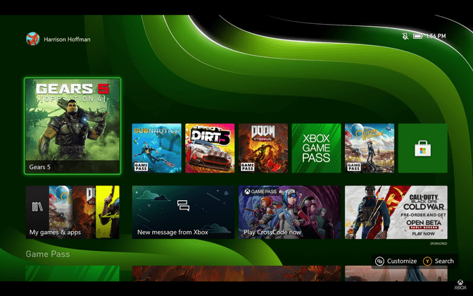
If there was one overarching convention for the PS5 UX, it was heavy usage of carousels and horizontal scrolling. The Xbox leans more heavily on a strong grid system with clear margins, like other notable software and operating systems from Microsoft. While using a carousel allows you to include more content than the screen can fit, it also hides content; neither is better, there are pros and cons to each approach. As a result of sticking with these types of grids, the Xbox's home UI ends up having a simple and approachable feel. This is further enhanced by the large, inviting content tiles.
...with some exceptions?
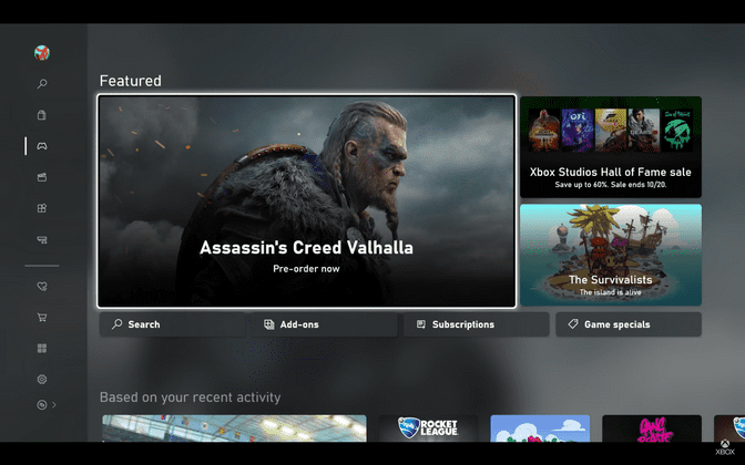
The Store is clearly using carousels and horizontal scrolling. While we don't get a good look at it, you can see one in the "Based on your recent activity" section below.
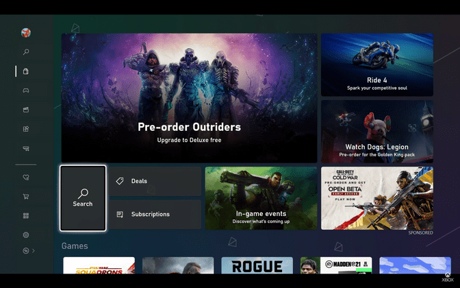
It also looks like the Games section of the default Store tab might be a carousel?
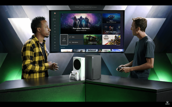
It looks like there should be enough space to see some of the next tile but we don't. Curiously, when they go to the wide camera, it looks like content in that strip is overflowing off screen. I can't explain the difference in appearance.
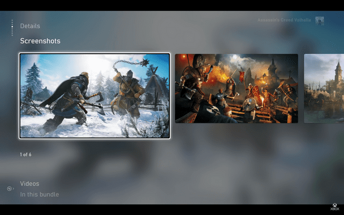
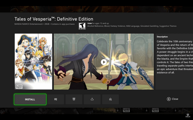
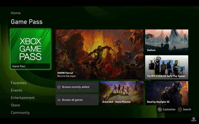
They creep up in a couple of other places, too—screenshots on game detail pages in the Store (safe guess that Videos shares this layout) and for general game detail content in the Game Pass section.
They're all shown quickly and never interacted with, so they can be easy to miss. Their usage is more sparing here than on PS5, and they seem to be used primarily in places where the content in the carousel is of a single type (except for the Game Pass example; that one's wacky).
In game menu is tidy and robust
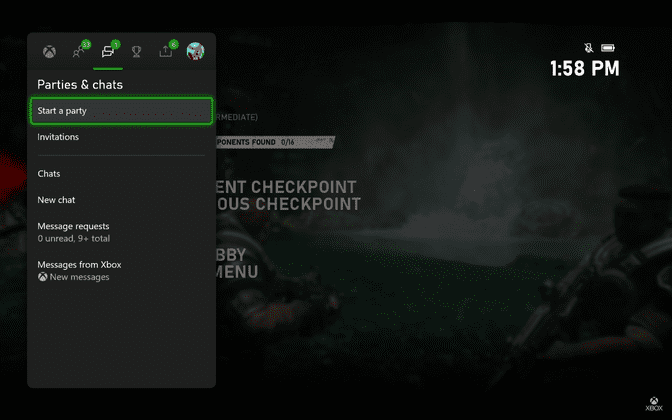
Again, we see another example of Xbox's preference for simplicity and intuitiveness in its system UI design with the in game menu. It's a collection of tab-organized lists with a static shortcut bar at the bottom for quick access to other key areas in the system.
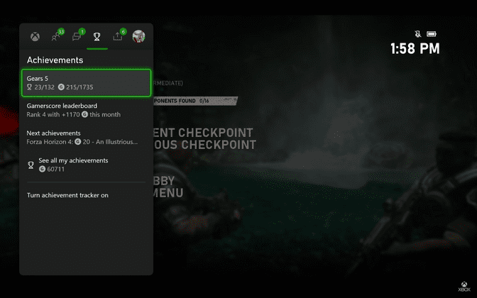
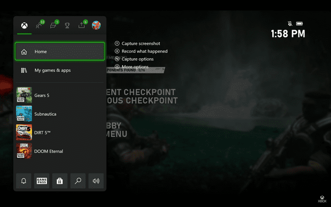 The default tab is more or less a compact Home view. It's broken into two sections, like all of the tabs we see in this menu.
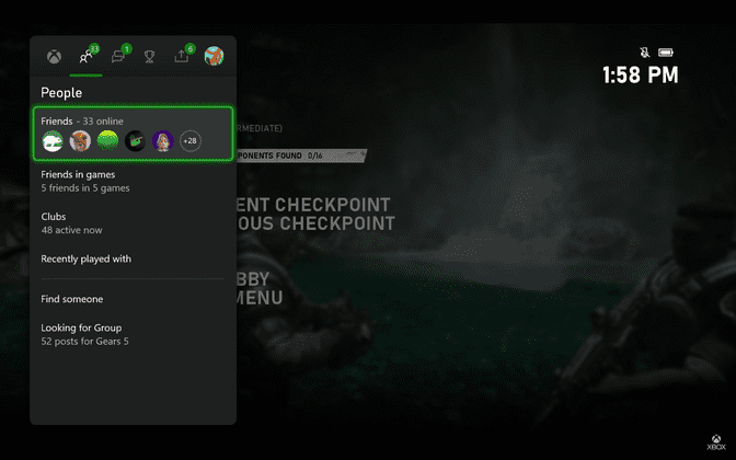 Nice touch tucking the Looking for Group functionality into this section.
"Turn achievement tracker on." I wonder why you are turned off for this demo? It's probably just to reduce noise but it's more fun to speculate that there may be changes they're not willing to show here yet.
Overall, the menu feels streamlined. It's more economical with screen real estate than the PS5's Control Center but it also seems like PlayStation is trying to do more with their solution than Xbox here.
Xbox app sidekick
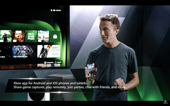
The redesigned Xbox app was highlighted as a key partner experience to the Series X and S. It was mentioned specifically as a better way to share game captures and as a part of the console set up process. Unfortunately, we were only given the tiniest of peaks at it while a phone was being held up.
It looks a lot like the Store and Game Pass areas but I'm not going to try and glean anything specific from such a tiny tease.
Purposeful content layouts
My favorite detail is the left alignment of key content tiles on the main/home screen blocks. For Home, you have the current (or most recent) game in the initial position and right below it is the all games tile—presumably the two of the most important tiles in this section and they're easily accessible from the the moment you arrive here. There's also some additional right margin separating those tiles from the others in the grid. It's just enough to visually set them apart. We see this in the Game Pass block (next screenshot), as well. Nicely done, Xbox.
There are a lot of "blocks" we didn't get to see
I couldn't help but notice how many blocks the new Xbox UI has that we didn't get to see. We spent most of our time on Home and got see the Game Pass block before navigating to the full Game Pass area but there are still five more we didn't even get a teaser for: Favorites, Events, Entertainment, Store, and Community. They're all self explanatory but I wonder if they all share the same layout or introduce some differences to highlight their unique content.
Game Pass is laid out nicely
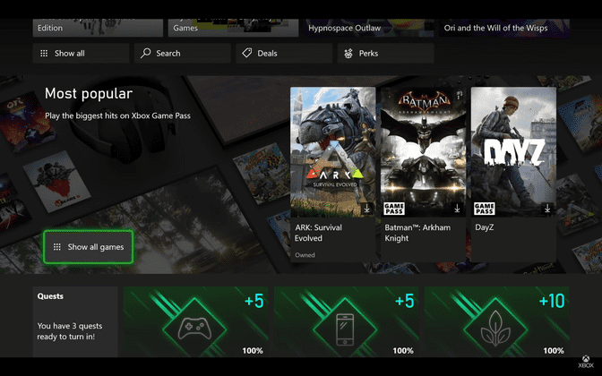 I just want to point out how pleasant the layout in the Game Pass area is with its varied content blocks and components. I'm not sure why the Most Popular section has additional left and right padding (its content doesn't line up with the left and right margins in the sections above and below) but the way the layout changes as the page is scrolled feels quite nice. I assume other sections lower down do something similar. This is somewhere Xbox wants you to browse and they've done well to lay it out in a way that visually rewards you for moving through it.
I do wish Xbox gave us a more in depth look at the system software but based on what I've seen I'm confident they've put together something functional and on-brand. They said it in words and backed it up with their design; the goal was to make something folks new to Xbox could also easily use. Considering the approach they've taken with their new consoles that feels like the right philosophy. The Game Pass area was my favorite and is a nice taste of some different but still fitting mostly grid-based design. I hope to see a bit more of that in other places we haven't seen or in future updates to familiar places in the UI.
