whatbrentsay
10/21
Sony took time last week to briefly walk through the PlayStation 5's UI. The reveal left me feeling positive about what they cooked up. I took a closer look at the video with my design hat on and captured some details that stuck out to me. I can't resist when it comes to this stuff.
Control Center, cards, and their order
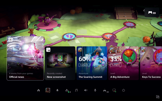
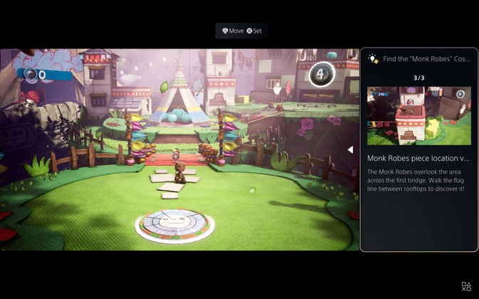
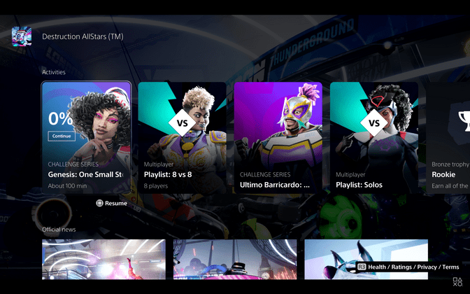
The Control Center users can call up while in-game contain a varied and contextual set of cards which offer news about games, access to screenshots taken, and tracking against in-game tasks. What I found most interesting about these cards is that their order appears to be dynamic. Here's what we saw the first time the menu was pulled up.
The list is scrolled horizontally to reveal a few more off screen.
Note the order: game news/updates, recent screenshot, an in progress Adventure, an in progress level, and then several other levels. The presenter dismisses the card UI and runs around for a few moments in the game world before pulling the menu up again.
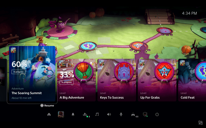
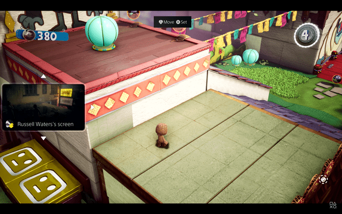
Okay, a few things have changed.
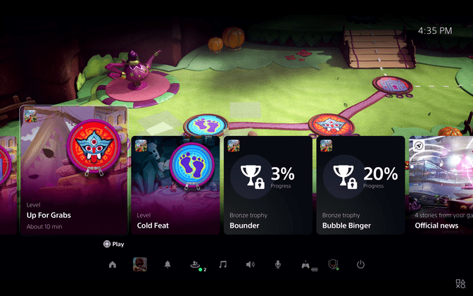
First, the news and screenshot cards have disappeared. We see later on when the Control Center is called up again that the news card has actually moved.
From a later glimpse at the Control Center I'm assuming the screenshot card has moved to the very end of the Control Center strip.
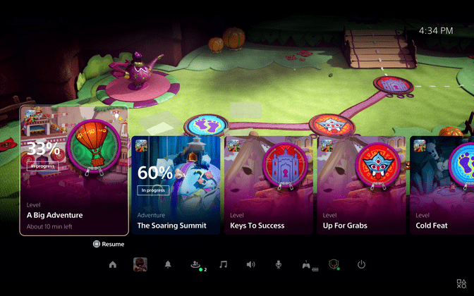
In addition to the movement of news and screenshots, the position of the in-progress Adventure and in-progress Level changed; they swapped positions. The player ran around what appears to be a hub area before that, stepping over several levels in the process. The positions of their respective cards didn't change, however.
We also got to see a few trophy cards, both of which were in progress. That brings us to at least five distinct card types in the Control Center.
I've seen too little to confidently guess at exactly how the order of cards is determined but there's some kind of weighting system at play here. The updates card was first in line and I'm guessing that's related to the system coming out of rest mode—pretty reasonable to fill in the player on news they may have missed while away. My guess for the screenshot card being second is that the screenshot was taken before the system was put into rest mode and the player did not interact with the screenshot in any way. I'm less sure about this one, though; the player takes a screenshot later, during Destruction All Stars, and the menu doesn't display the screenshot card anywhere we can see. There's some additional nuance there I can't yet divine.
For the trophy cards, I expect the total amount to be limited in some way. Even showing all in progress trophies would significantly increase the amount of items in the Control Center. Maybe it always caps at two. Two what, though? The two with the most progress? The two most related to your in-progress Adventure/Level? There's got to be additional logic to govern the truncation but I can't say here.
The movement of some cards—news and screenshots in particular—implies that seeing cards can affect their weighting. Additionally, card grouping doesn't seem to be strictly by type. If so, we shouldn't have been able to see a configuration where the Adventure card sat between Level cards. Instead, we saw in-progress cards before others, implying status has heavier weighting.
I like the Control Center element and the implementation here looks promising. Moving items around a UI can be jarring if the rules that govern it can't be quickly intuited by users. I haven't seen anything here that worries me (yet) but I'll be paying close attention to it when I get to use it.
Docked panels, picture in picture, and multitasking
In general, the multitasking shown looks much better than what PS4 offers. It looks better than anything I've seen on any game console. I'm shocked by the ability to dock certain panels to the screen and even more surprised by native picture in picture video support.
I'm particularly impressed with the control they've given to the player with the PiP window. Free placement of it would be madness, of course. Instead they divided the screen into a nine cell grid with eight likely cells the player can move the window to. I guarantee the middle of the screen will not be an option. You can @ me if I'm wrong.
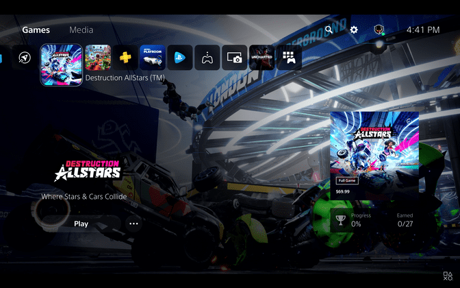
Functionally, the PS5 home screen appears to work much like PS4's
Sony seems to be refining the wheel rather than reinventing it here.
The horizontal, tile-based layout from PS4 returns but with a few differences in layout, style, and interactivity. First off, the carousel's tiles sport rounded corners and are smaller in both their inactive and active states. The hub area for each game is reminiscent of PS4, as well.
I find this layout to be somewhat awkward, though. There's a lot of white space between the left and right aligned elements and the content carousel navigation at top. Additionally, there are three distinct components in this state that are communicating the same information—the selected game title. I'm also curious why the right aligned components don't have rounded corners like most other elements in this part of the UI. More on those corners shortly, though.
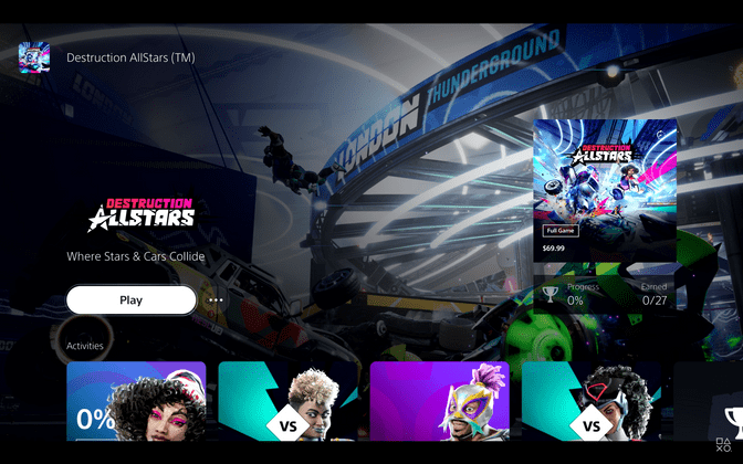
Just like in the PS4 UI, navigating down takes you into the hub for the particular tile you've selected. Rather than tabs controlling visible content, all content is visible at the top level in dedicated horizontal strips. The PS5 experience very much embraces horizontal navigation.
Tiles, cards, and corner radii
Yeah, this one is minor. Most of the tiles and cards in the PS5 UI have rounded corners—cards in the Control Center, card detail panels, the PiP window, docked Adventure panel, party notifications, Activities in game hubs, and even game tiles on the home screen carousel. There are some outliers, though: all tiles in the Official News section of game hubs, game tiles in the PlayStation Store, and all tiles we were shown in the Explore section. This inconsistency is odd but I am assuming its deliberate.
My Hail Mary guess is that tiles with sharp corners navigate you to a new screen. Store tiles would take you to a dedicated game page, Official News tiles might take you to a hopefully much better built-in browser, and perhaps the same for the tiles in the Explore hub. If true, I get the why but I'm not a fan of the execution. A visual indicator that decorates the tile (ex: an icon in a corner) would have allowed for consistent rounded corners throughout the entire UI and also a more direct way to indicate what a given tile does.
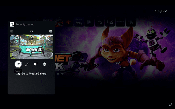
It looks like you can favorite game captures
If a game has a photo mode, I'm going to take an unreasonable amount of photos. That's the kind of gamer I've become. Sifting through all that content gets tiresome. If the heart-with-a-plus icon is what I think it is then I'd guess there's a dedicated space in the Capture Gallery for favorite photos. Perhaps per game or overall—my hops is for both.
Games and Media are separated
They called this one out specifically but I just want to explicitly express my gratitude for this change. Also worth noting that the new Capture Gallery may not count as Media if I'm correctly guessing what that camera-in-front-of-a-square icon is. I'm looking forward to seeing what they've done with the hubs in the Media section. Perhaps they've introduced new functionality to further justify the thematic separation. I'm not expecting it to behave too differently but not showing it at all has left me in full speculation mode.
